
Occasionally I come across a post like this on my Threads feed.
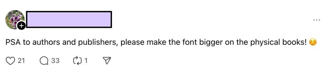
It’s a valid complaint. Many readers prefer ebooks because the formatting can be adjusted to make the text easier or more comfortable to read.
My own ereader settings include using open dyslexic, a font that increases readability for people with dyslexia. I haven’t been diagnosed specifically with dyslexia, but I do have ADHD and there are solid overlaps between the two.
So why can’t publishers just make the font bigger like this Threads user requests?
The answer is pretty simple: Cost
More Pages = Higher Price
There are several factors that influence the cost of printing a book, but page count is the biggest determining factor.
A few pages isn’t that big of a deal, but typically when we increase the size of the print, the page count increases pretty dramatically. Here’s what I mean.
Below are a series of screenshots from Roots in Ink as seen in the preview pane of my formatting software. Notice how the page count changes with each adjustment.

PT Sans, 12pt


Additional Costs for Special Editions
Even if an author wanted to offer a large print edition the costs don’t end with printing.
The large-print book would need its own ISBN and cost of those range between $10 and $150 depending on how many you buy at one time.
The book would also need its own cover to accommodate the larger spine.
Meeting Somewhere in the Middle
Now, I for sure know that the Big 5 publishing companies have the cash to make their books more accessible and offer more large-print editions without jacking up the price.
But I’m not part of the Big 5 so I have zero influence on their formatting decisions.
Indie authors like myself can figure out a place in the middle that increases accessibility without severely increasing the price of the book.
You may have noticed that some of my promotional materials mention ADHD friendly paperbacks. And maybe you’ve wondered what that meant.
It means the book is formatted in a way that appeals to neurodivergent readers.
There isn’t a ton of information about how to do this and what is available is geared towards nonfiction books, web content writing, and marketing material. It was very much a take-what-you-need-leave-what-you-don’t kind of situation, but I was able to figure out a set of personal guidelines to work with.
Larger typeface
12pt and no smaller than 11pt. Depending on the font, 11pt is better for my pocket-sized novellas.
San Serif Fonts
PT Sans or Open Sans
Fonts without the little squiggles are easier for neurodivergent people to read because the letters don’t run together. These two fonts are also a bit wider and have a more space between the letters.
More White Space
Using 1.5 line spacing and left alignment adds more white space to the page, keeping the words from turning into a block of text. The uneven lines also add visual variety that keeps the brain engaged.
Short paragraphs
Again, avoiding large blocks of text. Short paragraphs are already part of my writing style because of my background in print and digital journalism.
Formatting my books in a more traditional manner would decrease the print cost and make for a more attractive interior. But, I believe I found a reasonable compromise between readability and price and the feedback so far has been really positive.
